- Tips & Tricks
- Jan 14, 2022
sRGB vs. Prophoto RGB vs. Adobe RGB: Which one is better?
“You don’t take a photograph, you make it” — Ansel Adams.
Color palettes play a fundamental role in defining image quality. They’re the building blocks of any picture taken and displayed. Therefore, it is imperative for photographers to have a thorough understanding of color spaces because it ensures that their images will be seen as they want them to be. Different color spaces are used in electronics like sRGB, Adobe RGB, and DCI-P3. The most common one is sRGB. This article will guide you thoroughly about which model you should use for what purpose.
We’ve tried to gather all the relevant information and details after thorough research to make sure you can get comprehensive knowledge from this article. Let’s explore the details of this concept to get a better understanding:
What is meant by Color Spaces?
It might seem a complex term to understand, but we’ve managed to make it a bit easier for you. By definition, they are mathematical representations of hues on X, Y coordinates. In simpler words, different pigments are created by mixing primary shades, i.e., Red, Green, and Blue in the RGB.
The human eye can see a specific range of colors, a small part of a broad electromagnetic spectrum called visible light range. The colors in that range can not be categorized into clear boundaries.
This visible range spectrum has an extended form represented by CIE (International Commission on Illumination) in 1931 as a chromaticity diagram on two-dimensional coordinates as shown below:
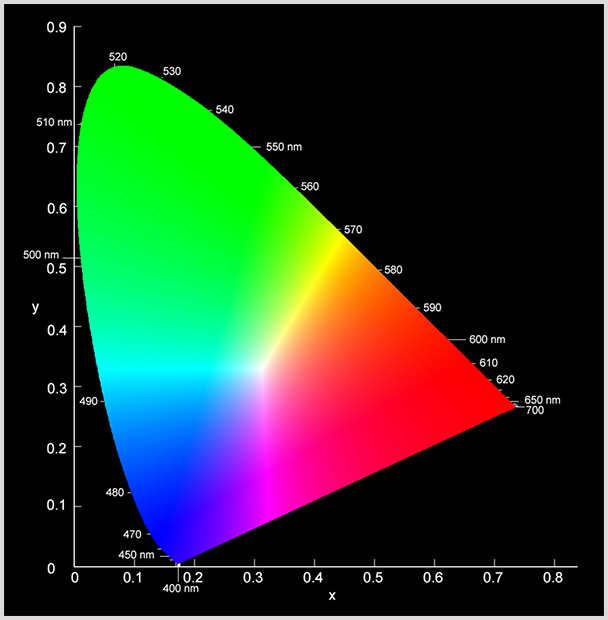
Every color inside this horseshoe-shaped pattern is perceptible to the human eye; anything outside this range is beyond our visible spectrum.
We’ve seen some stunning images losing their beautiful vibrance and spirit due to the selection of dull hues and irrelevant color palettes. Color models put soul in pictures taken by a simple digital camera. RGB and CMYK are the most frequently used models. The most preferably used profile is RGB, especially in the digital world.
What is sRGB mode?
HP and Microsoft collaborated in 1996 to present a standardized color space known as Standard Red Green Blue (sRGB) space for electronics. The International Electrotechnical Commission has provided a standard for sRGB in 1999. Today, we can use sRGB for gaming, websites, video & photo editing, monitoring, graphic designing, and printing.
You might have heard of electronic appliances covering specific sRGB percentages like 100% or 125% sRGB, which shows how much vibrancy and coloring profile those appliances can display. In contrast, their sRGB color gamut represents which shades they can visualize from the respective palette.
Several other modes were available when launched, but a standard was imperative. At that time, sRGB won the race because it ensured a consistent portrayal of colors compared to other color models in every device, whether a 17” laptop screen or a 2.5” (width) mobile display.
It neutralizes the hues so that images look the same regardless of the monitor used for display. In layman’s terms, you don’t have to worry about the color difference at any display because, in sRGB, you’ll see the same quality on every screen.
Adobe RGB Color Space
We’ve discussed the efficiency and consistency we get from sRGB. So the question is: If sRGB has that potential, then why is Adobe RGB or DCI-P3, or ProPhoto RGB needed?
There is no lie that sRGB dummies down the shades of images and makes seamless changes in the color combinations. However, those fancy displays may look great on-screen only; sRGB’s color saturation does not work when it comes to the paper.
Here comes the role of another color model, CMYK, which represents four primary colors, i.e., Cyan, Magenta, Yellow, and Key/Black. As per research, the sRGB colors are based on additive properties, meaning they add to each other to generate new colors.
Whereas, in CMYK, a subtractive property plays the leading role in forming new shades, which means these colors get subtracted from each other to generate new ones. When they all combine, the Black then masks all different colors.
All print shops prefer CMYK mode because this model maintains the integrity of shades on paper. Companies’ liability remains at stake if they fail to generate high-quality print. That’s why they prefer to use CMYK mode.
And that’s how Adobe RGB color space came into existence in 1998. Adobe offers an alternative to the photographers to retain their photo quality on the piece of paper.
What is ProPhoto RGB?
With the evolution in technology, monitors and printers have also become considerably more advanced and efficient than those previously available. They can display a wide range and better saturation of colors which is way more than what sRGB has.
So for photography, depending on how much pigmentation a model can cover, Kodak’s ProPhoto RGB came out as a winner round fair and square. Kodak’s Prophoto has the edge to display as many colors as possible on the Ektachrome. Even Lightroom has a version that can work with Prophoto RGB. That’s why it has more popularity among aspiring photographers.
ProPhoto RGB vs. Adobe RGB vs. SRGB: How to Choose?
Some frequently asked questions are: Is sRGB better than Adobe RGB? Is Adobe RGB suitable for photography or ProPhoto RGB? Why is sRGB not used for printing? We are here to give precise and understandable answers to all these questions.
The comparison between these three color spaces is not new but quite misunderstood and misinterpreted all over the internet. We’ve discussed these spaces in detail earlier; now, let’s move forward to the actual use of these color models.
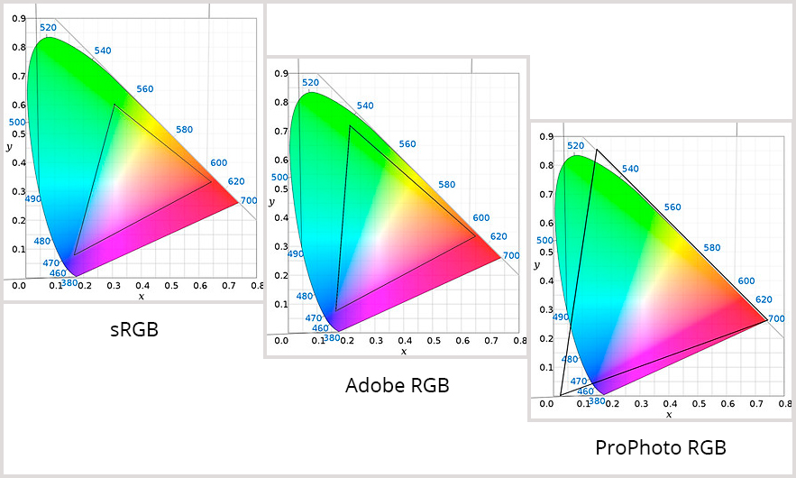
sRGB is the smallest color profile covering a wide range of hues, and it can be found in every digital device, no matter if it is twenty years old or recently launched.
Despite bigger RGB models, there is a specific reason for using sRGB as a standard even in 2022. All devices have different gamut limitations, and they need a small gamut that can fit evenly in all gadgets because all other models have a larger gamut than sRGB, so it comes out as the top choice for all display screens.
It is reasonable to consider sRGB for web display or on the monitor’s screen. However, sRGB can not give off the exact rich detail on the paper as it can display on any screen when printing. That’s why for most printing companies and publishers, Adobe RGB is preferred over sRGB.
But, what about photographers? Which color space is good for photography?
While shopping online, a product seems quite attractive, but it looks entirely different from what was ordered in the first place when delivered. Have you ever thought about what made them look different online and in print? It’s the color saturation.
Photographers should use ProPhoto RGB while shooting to offer more realistic image prints. In Layman’s terms, you’ll get what you’ll see.
All color space options are available in software and tools; you can easily convert RGB to Adobe RGB or ProPhoto RGB in Lightroom and Photoshop. But, we recommend using ProPhoto RGB for showing off your photography skills.
Adobe RGB and ProPhoto RGB for Printing
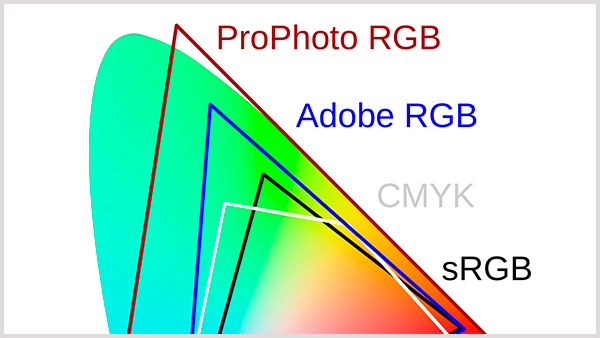
As we can see, ProPhoto and Adobe have a more extensive gamut than sRGB, and the ProPhoto spectrum is a bit outside what humans can see with the naked eye.
What does that mean, and how does it make ProPhoto RGB good for photography and printing? Do photos in large color spaces have more colors or not? The answer is quite simple. It is inaccurate to say that ProPhoto has more colors than other models, but it represents a more refined range and more saturation than other color spaces. That’s why photos appear more vibrant and eye-catching when using ProPhoto RGB space.
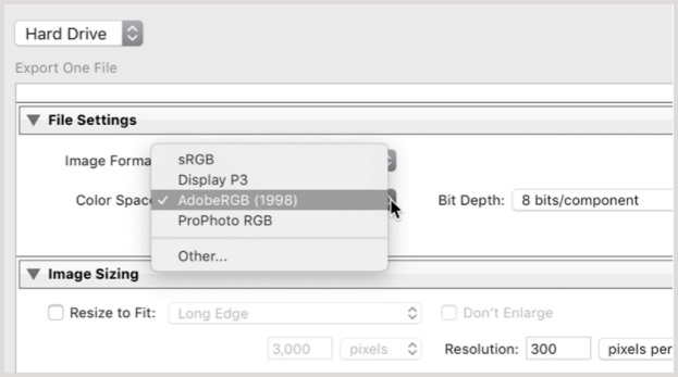
sRGB/Adobe RGB/ProPhoto RGB Camera Settings
Novices don’t know about the settings of color modes and spaces in the camera so, when they capture an image, it comes out dull and bland. After reading this piece of work, you’ll get the know-how of when to use these modes and for what purpose.
You can find all modes on a modern digital camera setting like this:
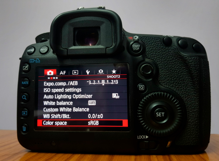
Pro Tip: Make sure you use these settings on the JPEG files because these settings do not apply to RAW photos.
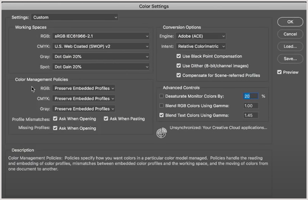
Photoshop Color Space Configuration
The color space is assigned to these images during the conversion process. The converter gives a mode to these images by embedding the color space in the metadata color profile, i.e., ICN/ ICC profiles.
You can adjust the color settings and add profiles in the color space through the settings.
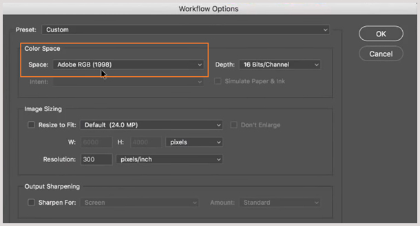
You can see the color space at the bottom of your screen like this:

Click on this option, and a new window will pop up like this:
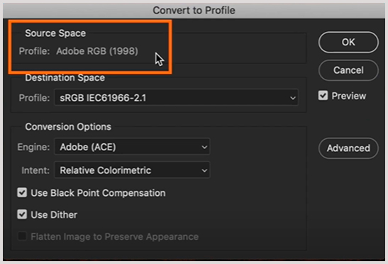
You can also find the conversion settings in the “Edit” option at the top left corner. A list of options will pop up; you can select the “Convert to Profile” option there:
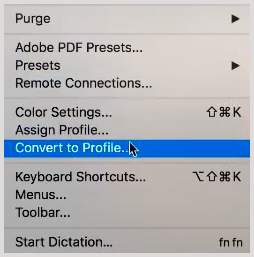
Another window will open up; select the desired profile from the “ Destination Space” option.
Color Space Settings in Lightroom:
This topic needs a lot of step-by-step detail, which is difficult to cover here, so we’ve mentioned the precise method for adjusting the images in lightroom. Here’s a brief explanation:
In Lightroom, just go to the preferences by clicking on the Lightroom option available at the top left corner, a new window screen will open up like this:
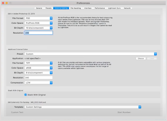
You can change the color space in the lightroom with just one click. Bit depth and file format can also be changed by clicking on the available options.
Photo Printing Process
It’s a tricky job to print an image with the same tints and textures as it displays on the screen. To avoid dusky prints, you’ve to prepare your picture before publishing it on paper. Photo printing is beyond the scope of this article, so we’ve mentioned the details in a precise way here:
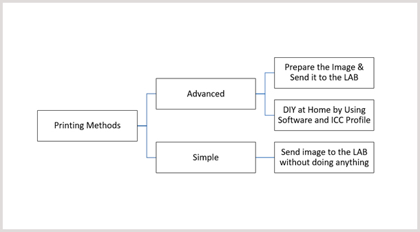
Methods of Printing an Image:
You can print images using two different ways:
Simple:
It is the easiest way to print a photo in which you don’t have to put much effort. You can select any printing lab of your choice and can use their color correction option if available to enhance the image quality. The respective lab will get the job done for you.
Advanced:
This one is quite a technical process which can be done in two ways, i.e., by yourself or by professionals. If you want to get some professional, aka lab help, then get their ICC profile for paper, edit the image in Photoshop or Lightroom and change the color space to ProPhoto RGB by the process as mentioned earlier. Convert image to ICC file of printer and send the file to the lab with instructions to avoid color corrections.
However, if you don’t want to spend money, you can still have eye-catching prints by doing the whole process at home. Follow the same steps for doing it yourself; however, you’ve to use a print module while editing the photo in software.
Pre & Post-Processing of Images:
Preparation and post-processing of images is a time taking but rewarding task. These processes are for quality-conscious geeks who always look for realistic photo prints. Here are some simple tips to get stunning results.
- Monitor Calibration: If your monitor isn’t calibrated, you’ll get different image results on other screens and in print. You need calibration software and a spectrometer to ensure your monitor displays balanced tints.
- Choosing a Background: This tip is noteworthy for product photography. Having a transparent background is the essence of any image taken. If you capture images for a brand, remove background from the image before processing it.
- Set Dpi: For a better resolution, set the dpi to 300 rather than 72 dpi otherwise, you’ll end up with pixelated image prints. Low-resolution looks great on screen, but printers perform better at higher resolutions.
- Use Color Grading: You can use software like Photoshop or Lightroom to enhance the overall look of images. Color grading enhances the ambiance of the images that pique the viewers’ interest.
Final Thoughts:
There is not a single color space that works well on the web, screen, printer all at the same time. Therefore, choosing one from sRGB, Adobe RGB, and ProPhoto RGB is difficult.
While some work well on all screens, others work wonders for printing or landscape photography. Each has unique benefits that can not be fulfilled with other modes. The difference is not in colors but the range and saturation of these colors.


Comments (0)